Evidence for the slope of the supply curve
This is a companion post to the previous one. In that post I argued that NGDP was superior when the supply curve is nearly flat, in this one I argue that the empirical evidence strongly favours a flat supply curve at the following times.
What follows are a series of plots of RGDP vs NGDP with associated trend lines.

We are looking at the slope of the supply curve.
The gradient of this graph is 0.55, it shows a reasonable correlation of 
Now lets look at 1990-Present, i.e. the era of low inflation. Now we see:

This shows RGDP vs NGDP 1990-Present
Note that now, in this era, a 1% point rise in NGDP is associated with a 0.85% rise in RGDP. I.e. The supply curve is very flat. This is exactly the danger area identified in my previous post, where in order to reduce inflation by a small amount, one must sacrifice a huge amount of output. A 1% reduction in inflation would correspond to a 6% reduction in output. Note also that the correlation is a lot better in this era, than in the whole data set. This should increase our confidence that this is a meaningful subset – i.e. that there is something qualitative different about this selection of points from a random sampling. In this case, the adoption of a low inflation target.
We can also estimate “expected inflation” from this analysis. Expected inflation is the level of NGDP growth needed for RGDP to be flat, so in this case, 1.44/0.849 = 1.7%. Since this is close to the inflation target, that is further evidence that this analysis is meaningful.
Lets look at the 1970’s. We might expect that this is a time when we got onto the vertical part of the supply curve, :

Note that even in this era, the supply curve appears flat, it just has an enormous intercept.
This time we have an expected inflation reading of 6.5%, along side an almost identical gradient. We can say here with some confidence that inflation expectations were higher in the 1970’s, but what to make of the identical gradient? I expect what we are seeing here is expectation adjustment. Every time the expectations adjust you get moved back onto the flatter part of the supply curve. This is the theory of the inflation adjusted Philips curve. This causes the correlation to break down, as a change in inflation expectation moves the whole line up and down.
Lets look at this era in more detail:

This shows how inflation expectations developed
Here are two periods, Oct 68 to Jan 72, and Oct 73-79/01. In both of these periods we get pretty good correlations, but inflation expectations have jumped, and the supply curve becomes even flatter. Perhaps what is happening here is that as uncertainty about inflation becomes chronic, output falls, and we get onto the flatter part of the supply curve. Here inflation expectations jumped 5 percentage points in a few years. This is indeed puzzling. Perhaps the real lesson here is that the supply/demand framework does not work well without a nominal anchor around which to have “unexpected” stimulus.
Nevertheless, the broad point stands: Throughout the 1990’s, the trade off between inflation and output was terrible. Thus, attempts to keep inflation on target by tightening policy in response to a 1% supply side shock to prices, would result in around a 6% loss of output. Given the small costs of small deviations from the inflation target, central banks should be prepared to tolerate deviations from the inflation target, provided that they are doing so in order to keep aggregate demand more stable, because the costs of a loss of demand are huge, and the costs of missing your inflation target are tiny.
Nowhere is this more clear than in the 2011 rate tightening of the European Central bank, which in order to prevent a small overrun in its inflation target, was forced to induce a catastrophic loss of demand.
Visualising NGDP Targeting
The AS-AS framework gave rise to one of the iconic images of Economics. Almost everyone who has studied or followed economics will have seen a version of the following diagram:

The AS-AD Diagram – from Wikimedia commons
Now, the stylised facts of this diagram are these
- The supply curve is upward sloping : A higher price usually means a larger quantity can be produced. Think of how a higher price of Oil makes hard to reach reservoirs economic.
- The supply curve goes vertical at some finite level of output. This represents real constraints on production in the economy.
- The demand curve is downwards sloping – generally people buy a larger quantity of stuff when its cheaper.
We can understand the inflation targeting regime through the lens of this diagram. A supply shock moves the supply curve upwards. In order to return to the target price level, the central bank must move the demand curve leftwards. This is the reason to believe that inflation targeting is a sub-optimal strategy for a central bank – in this framework, in response to a positive supply shock, which decreases output, a central bank must deliberately generate a further fall in output in order to get inflation back to target. Think about that – in order to keep inflation on target in the face of a supply shock, we must deliberated produce less than we could. Moreover, in the real world, a loss of demand almost always means a rise in unemployment. So we are deliberately trading unemployment and lost production for in order to hit a 2% target.
The reverse happens in a positive supply shock. This time the supply curve is lowered, so the central bank shifts the AD curve rightwards. This rise in demand leads to a boom, and when the supply shock passes we find that the aggregate demand curve is too far to the right (policy is suddenly too loose) and we get a spike in inflation.
In the real world, its fair to say that we don’t “know” the shape of the supply curve and the aggregate demand curve. All we can measure is the cross over which actually happens i.e., we can measure the price level and RGDP and Lets specify aggregate demand by: 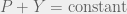


This diagram is just the AS-AD diagram with a third axis drawn on to represent NGDP. The red lines are lines of constant NGDP. The inspiration for this was Minkowski diagrams for switching between space time frames by drawing on the a second frame of reference.
A supply shock hits the economy, and as a result the supply curve moves from A to B. Originally, this moves us from the point marked start, to the point marked NGDP. Under NGDP targeting, this is where the story ends, as we have moved along a line of constant NGDP. We have some slightly higher inflation, and a small decrease in output, but this output loss was inevitable, as the new supply curve goes vertical well below the original level of output. Under inflation targeting, the central bank now forces AD/NGDP onto a lower path, inorder to return the price level to its starting value, Pi. This cause output to drop from Yn to Yi. In the example that I have drawn, where the supply curve is fairly flat, the decrease in output needed to bring inflation back to its starting value was far larger than the original loss of output. This is the disaster scenario for inflation targeting, where a large loss of output is required to correct a small change in inflation. This is arguably what happened in the US in 2008, and almost certainly what happened to the Eurozone in 2011, where policy makers focused on inflation, traded catastrophic falls in output to a void small overruns in inflation.
Of course, if I had moved the start point up onto the nearly vertical part of the supply curve, then we could have traded a tiny loss in output for quite a large change in the price level. Arguably, this was the story of the 70;s and 80s, where they were in a reasonably high inflation regime, and this put them well onto the vertical part of the supply curve, this, huge changes in inflation translated into only small changes in output.
On more nice thing about this diagram: it makes it clear that what we actually have are two `real’ things, the supply curve, and the demand curve. But these are unmeasurable, and we can specify the outcomes (where the curves cross) using any two of NGDP, real output, and the price level. The price level/Real output specification seems to have an almost sacred place in economics. When given a choice of equivalent decompositions, it is almost always right to thing in terms of the things which are easiest to measure. Here that ist he Price Level, and NGDP. An independent measurement of real output is almost impossible, as it would depend on some kind of notion of intrinsic value, so in practice, RGDP is measured by applying an inflation correction to NGDP. By using a Y,P decomposition, you are cross-correlating your measurement errors.
Finally, NGDP targeting always leads to a smaller output gap but higher inflation than IT when faced with a supply shock. If we are on the flat part of the supply curve, that is a good thing, if we are on the vertical part of the supply shock, that is a bad thing. given the general downards stickiness of inflation despite enormous falls in output in the US, UK, and EZ, we are definitely on the flat part of the curve, and so should be looking to NGDP growth, rather than inflation, to guide policy.
Deflation, Coming to a Continent near you
Deflation has finally arrived in Europe. It is now undeniably hear. While Mario Draghi continues to claim that inflation expectations are well anchored, the reality is that the ECB has waited too long to act, and now has a mountain to climb. They have repeated the policy mistakes of the Fed in the 1930s or Japan in the 1990’s, and refused to believe that monetary policy was the correct tool to manage aggregate demand. I am, in all honesty, surprised by the length of time it has taken. Ever since the ECB raised rates in 2011, choking off a nascent recovery this has been the predictable outcome. I thought 12% unemployment in the Eurozone would drive deflation in 2012. I suspect this is a feature of how we measure inflation. I have a whole series of posts coming up on how to measure inflation better, based on my original foray into this space, and some musings of the Atlanta Fed’s statistician, plus some Machine Learning insights.
Anyway, I just wanted to chronicle the arrival of deflation today:
The CPI recorded an annual rate of change of -0.9% in July 2014. Excluding energy and unprocessed food, the annual rate was -0.4%. The CPI monthly rate decreased to -0.7% (0.1% in June 2014 and -0.2% in July 2013), while the CPI 12-month average rate was -0.2% in July.

The EU-harmonised index (HICP):
                             JULY        JUNE         MAY
 Monthly change              -2.1         0.1        -0.1
 Yr/yr inflation              0.0         0.2         0.4
 Index (base 2005=100)      117.9       120.4       120.3

The NIC index:
 Monthly change              -0.1         0.1        -0.1
 Yr-on-yr inflation           0.1         0.3         0.5
 Index (base 2010=100)      107.5       107.6       107.5


Of course, Greece:

and Cyprus:

Even Sweden:

But don’t worry, this is all a needed competitive adjustment, which we can see directly from the robust inflation rates in the other, stronger UK economies:

Or perhaps from the robust inflation in the Eurozone as a whole?

Deflation is here. The ECB is out of excuses, and out of time. If it cannot deploy QE because of political impediments, then this depression is about to get worse. A lot worse. Ill leave you with some comments from a market economist, via Joe Weithensal:
For Euroland, the big picture is that the economy is in its seventh year of depression. On our estimate of a 0.7% contraction in the second quarter, GDP was still 3.2% lower than it was in the first quarter of 2008, when the depression began. Euroland’s economy actually contracted in the first quarter of this year when you exclude Germany’s unexpected surge to a 3.3% annualized rate of growth. Only people who were misled by Markit’s untested and unproven PMIs believed that such growth was real and sustainable. Our estimate of second quarter GDP for the Euro Zone includes a contraction of Germany’s economy at a 2% annualized rate, reversing the windfall in the unexplained and inexplicable first quarter spurt. If our forecast proves correct, average GDP growth for Germany in the first half of 2014 will work out to 0.7% at an annualized rate, clearly less than potential but very much in line with the experience over the last few years. Our estimate for France’s economy is a more horrible contraction of 1.1% for the quarter, or 4.3% at an annualized rate.
Italy’s Recovery

I saw this graphic referenced on Twitter.
Just incredible to see that five years into the Eurozone “recover” Italy is not only below its pre-crisis peak, its below its post crisis trough. Even more amazing to see how the ECB’s rate rise in 2011 choked off the nascent Italian recovery.
There is an ECB rate meeting today, since the last one inflation has fallen to just 0.4%, and inflation expectations have also fallen. I wonder what excuse Draghi will come up with this time to not announce QE.
